Greyhound.ca

Greyhound.ca
Website Redesign
In this project we were asked to redesign the IA for a site that needed some love. We chose greyhound.ca as it was clear that the site had not be updated in some time. We focused on four (4) main issues: 1. information overload, 2. business-centered, not user-centered design, 3. an unintuitive labeling system and 4. poor findability.
We began the project by analyzing the information environment through a content analysis, competitive audit and review of available business information and other user data (e.g., social channels, press releases etc.). Once we had a sense of what content made up the site and why it was used, we started putting together some ideas for taxonomy that could be tested with users in a card sort. From there we had enough information to create a draft of an IA Schematic.
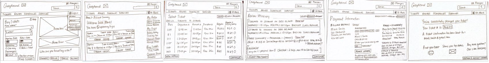
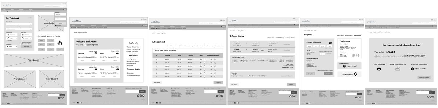
Once we knew generally how we wanted to organize the site, we were ready to start designing how content was to be displayed through wireframe sketches. We began with selecting a few key use cases that we identified in during the user interviews: buy a ticket, modify a ticket, and search schedules. We then took those sketches and put them in front of users and used that feedback to inform our final mid-fidelity prototype.


- Client: Greyhound
- My Role: Information Architecture, User Testing, Content Audit, Facilitator
- Platform: Desktop
- Sector: Travel
- Methodologies: Card Sorting, Affinity Mapping, Task Analysis, Content Analysis, Prototyping
- Tools Used: Optimal Workshop, Figma, Omnigraffle, InVision
- Skills Developed: Analytical Skills, Synthesis, Sketching, Design Thinking
- Artifacts: IA Schematic Diagram, Content Audit, Affinity Map, Card Sort Similarity Matrix & Dendrogram, Wireframes, Low-Fidelity & Mid-Fidelity Prototype